

Branding UI for Syneron Medical
Syneron is a leading global aesthetic device company with a comprehensive product portfolio and a global distribution footprint.
CHALLENGE
Long history of state of the art tool development along with company acquisitions created a tool portfolio that lacks common branding and common family look & feel.
SOLUTION
Novia took the challenge to design a unique UI/UX tool brand for Syneron various tools.
The brand dealt with the different tool families while keeping relation to a central, strong and modern look & feel.
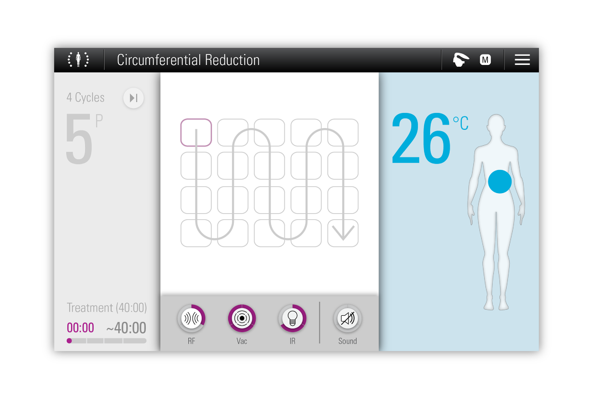
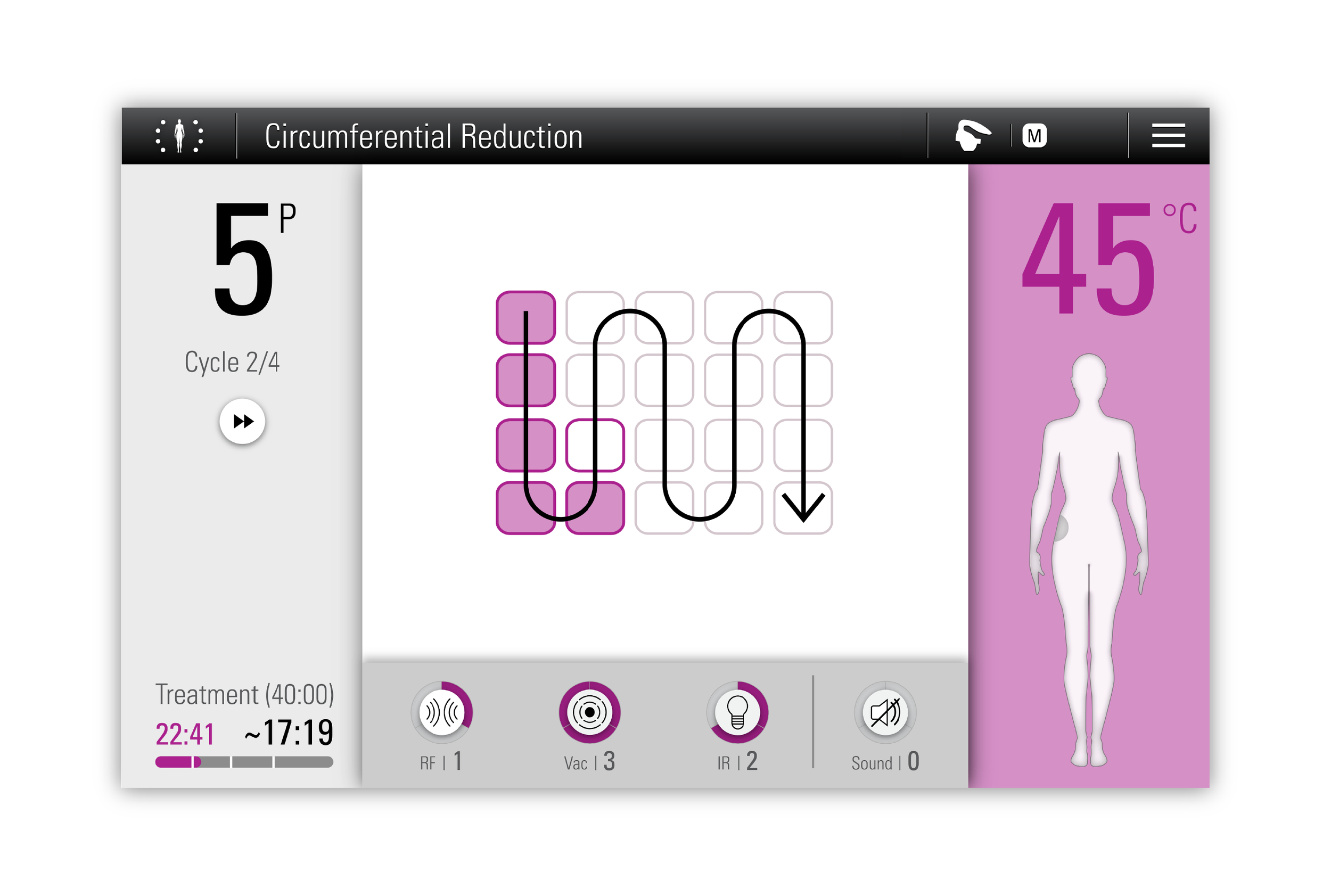
The Brand
Putting the human body in the center
Adding dynamics and movement to the interface
Creating main navigation and common interaction language
Body shaping
Products Family
Designing 3 different body shaping tool UI
They all fit into a touch screen with big controls that fits into the slick industrial design
They share common interaction language as part of the whole brand
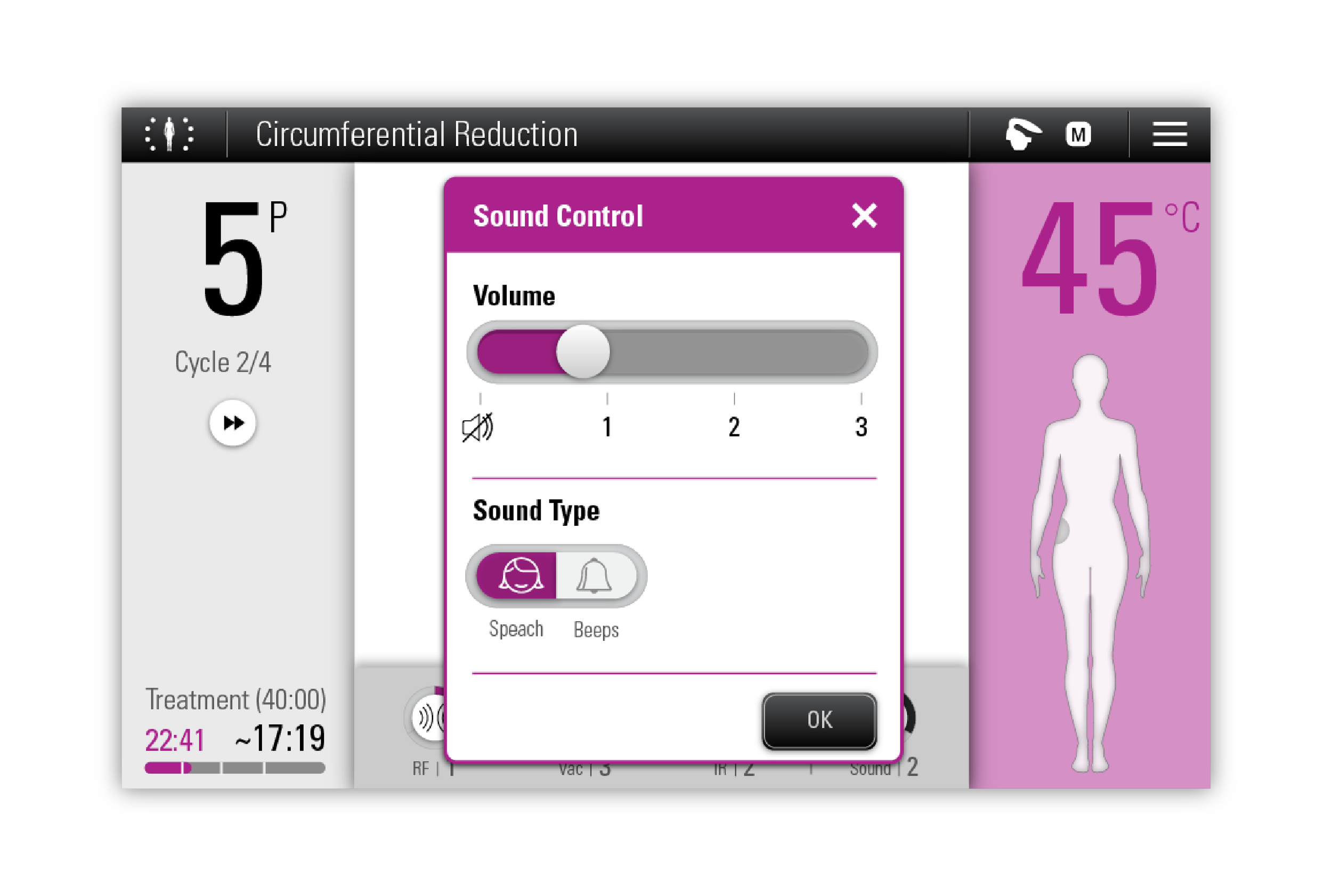
Individuality
Each tool has (off course) its unique experience that has to combine in the brand
The brand 'wraps' unique tool screens and gives them space for tool specific look & feel
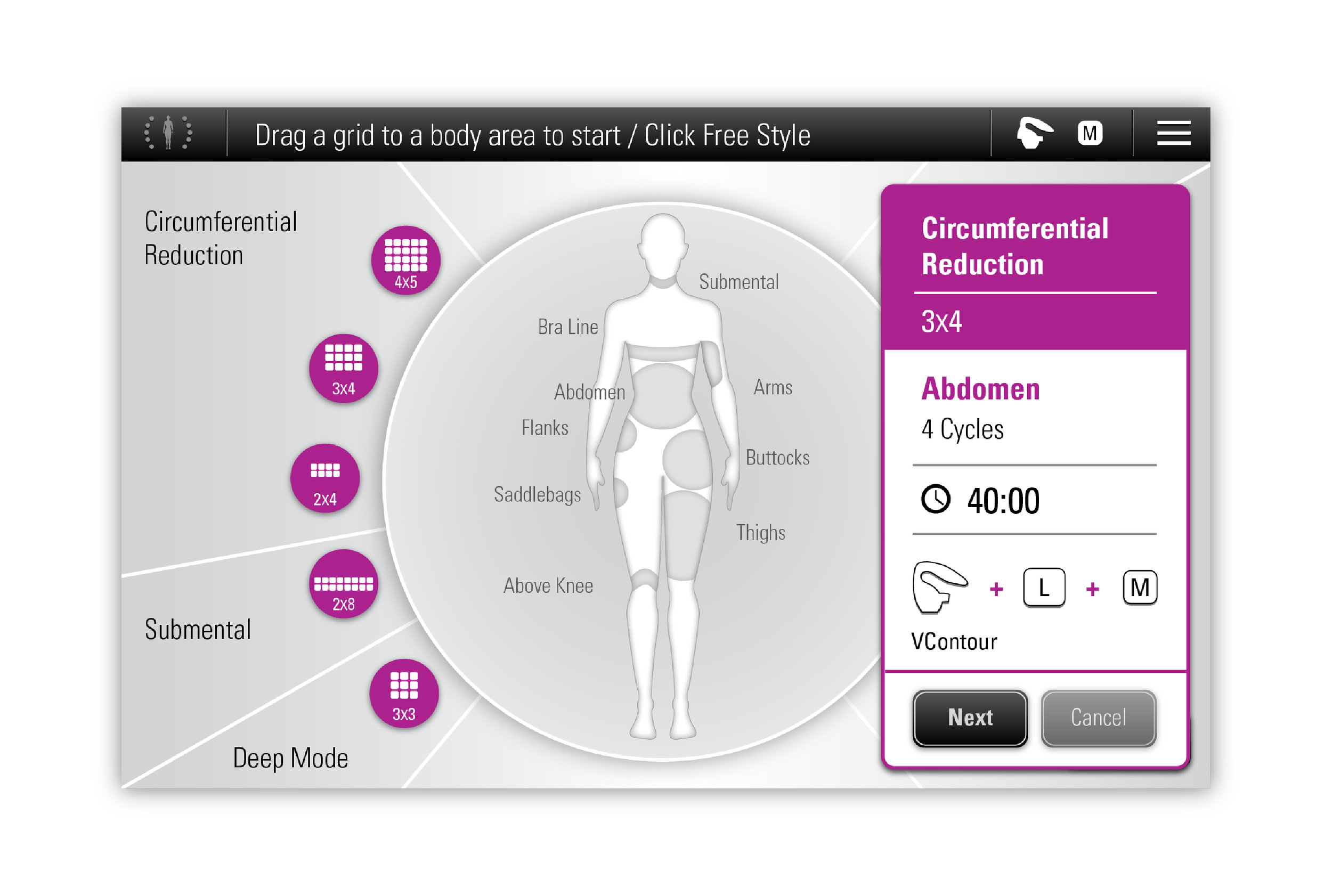
Iconography
The brand provides common icons that are mostly used for main navigation
Tool specific icons have design rules that they should apply to
Icon graphic design